 Aviya Koresh
GPT answers questions. Bump accompanies a journey.
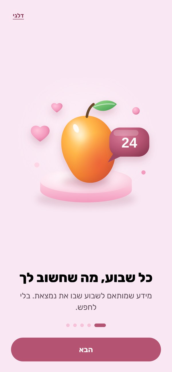
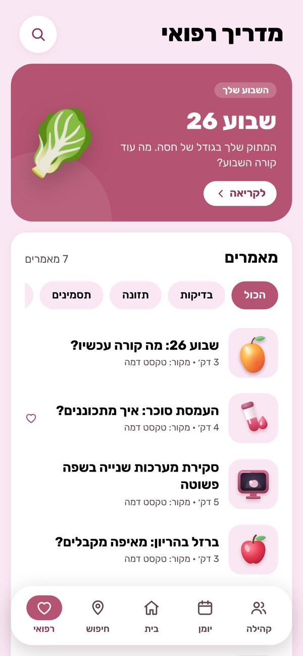
Information that changes with your exact week of pregnancy.
Pre-written and reviewed, not regenerated on the fly.
Groups, workshops and experts, from week one to the birth.
12 interviews, 4 pain points that kept coming up
Non-personalized info
No emotional support
Cluttered design
Hidden costs
2 first-time moms, 2 very different needs
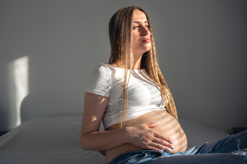
Maya, 34
First pregnancy · high-tech · packed scheduleNeeds: Evidence-based, personalized medical info
Pain: No time for long groups or endless searching
Lior, 27
First pregnancy · excited and stressedNeeds: Reminders and quick access to information
Pain: Fear of inaccurate info and the stress it causes
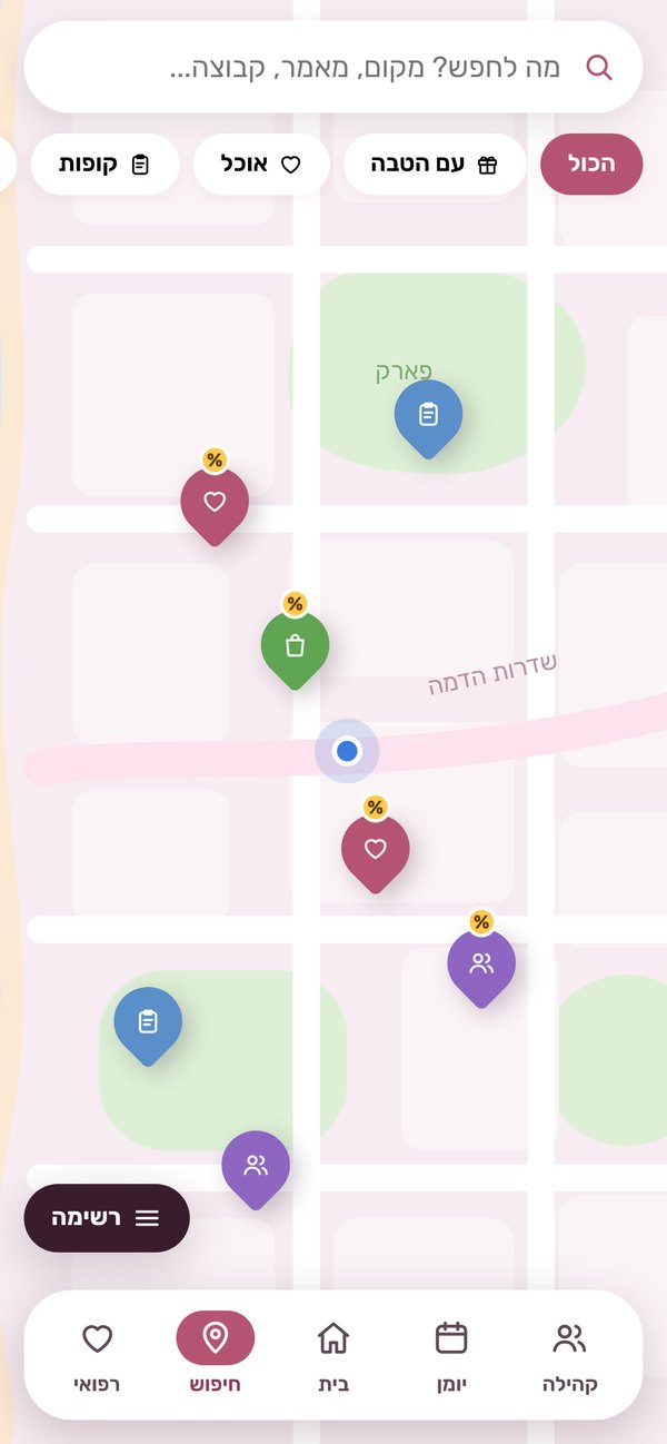
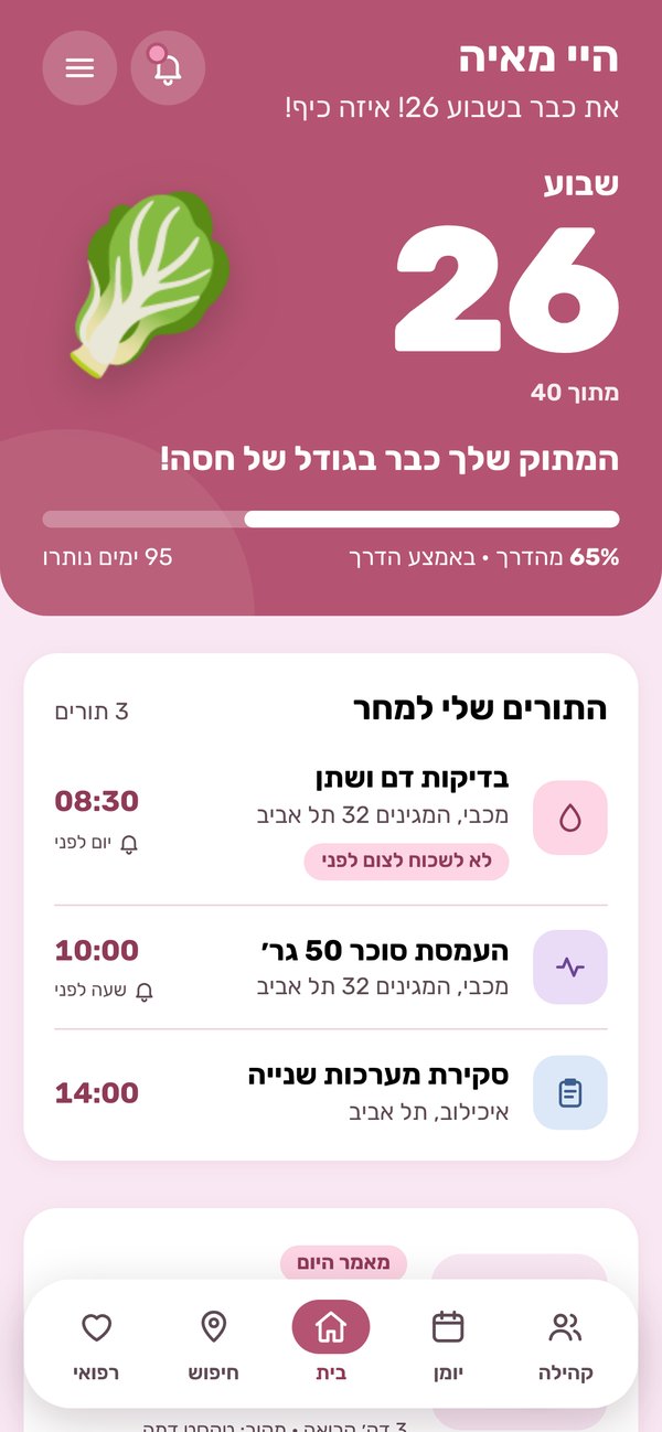
5 areas around 1 calm home screen
Articles, diary, search with a map, community, and nutrition & sport, plus a personal area for profile, notifications and settings.
Warm, calm, one primary action per screen
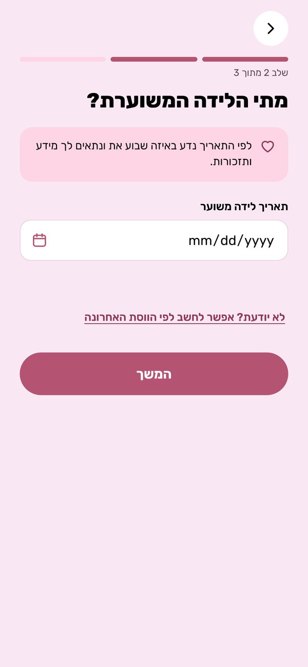
Before and after, and why
Tap a change to see the new screen.
The 2025 screens are not included in this case study, so the “before” is described in words from my own notes of what changed.
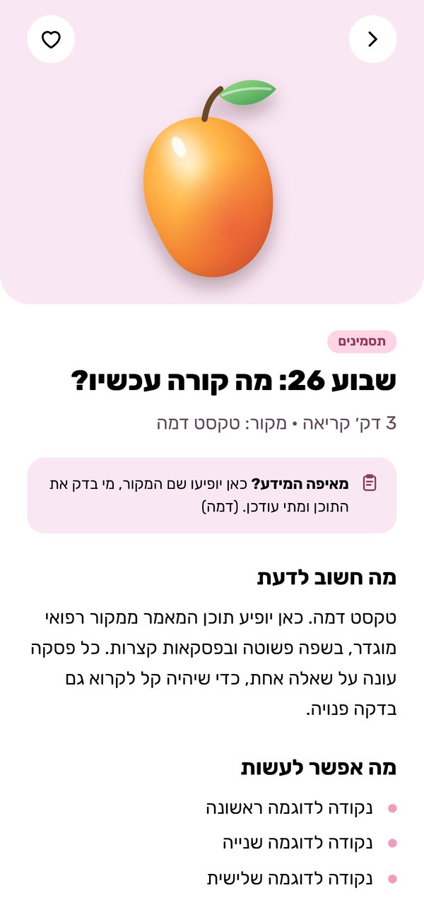
What the redesign decided, and why
Bump fits a first pregnancy best, when everything is new and unfamiliar. By the second you already know the way and have little time. So Bump walks the first journey with you, up to the birth.
3D illustrations for feelings and medical topics. Photos for the real world: food, places and people.
Partner perks for the community, clearly labeled. The map is sorted by moms’ recommendations, never by who paid.
How I worked with AI
I’m a designer, not a developer. I did the whole refresh alone, working with Claude Code, and made every product decision myself.
Reviewing the old work
I gave Claude Code the project folder: the deck, the Figma file and the old screens. We chose a home direction out of two options and wrote a short spec for every area before drawing a single screen.
Designing in code, screen by screen
Each area was built as a working web app for phone and tablet. After every step I reviewed it and pushed back: misaligned coupons, empty space in a card, icons that didn’t match the article they sat next to.
Decisions that stayed mine
First pregnancy only. Real photos for food and places, soft 3D for everything else. Perks that never change the order on the map. A journal that syncs with the phone calendar. Even the words: “terribly excited” became “very excited”.
Live and ready to test
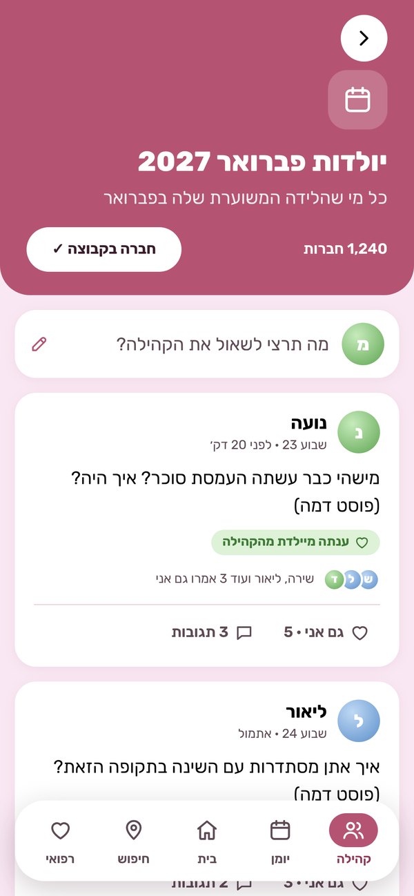
The prototype is online. Week, days left, baby size and checkups are all calculated from the due date, so it is ready for a usability test with first-time moms.