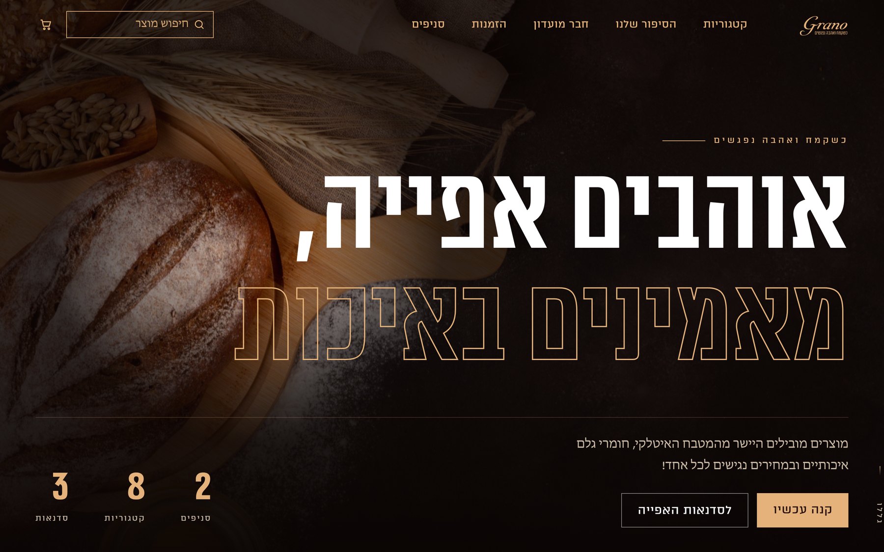
 01Dark gourmetExplored
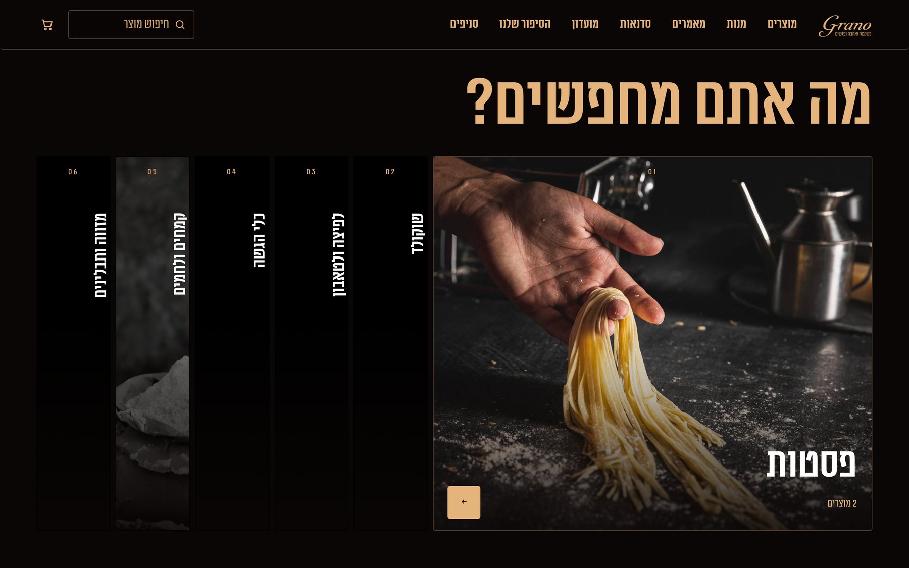
01 · Dark gourmetTested huge type and categories that open like a fan. I kept the fan.
 Aviya Koresh
Available for work
A flour and baking shop, redesigned from the brand book up.
4 directions explored, 1 built as a working site.
אוהבים אפייה, מאמינים באיכות
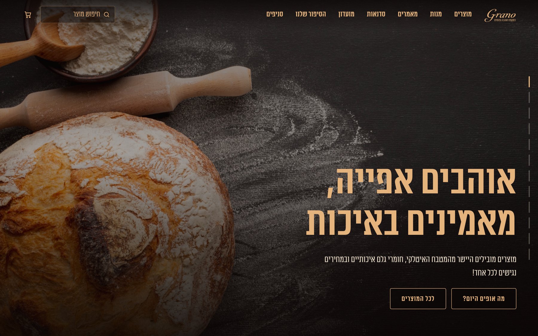
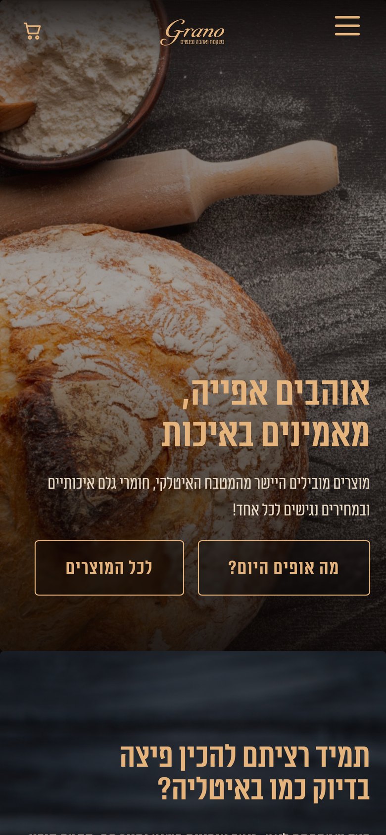
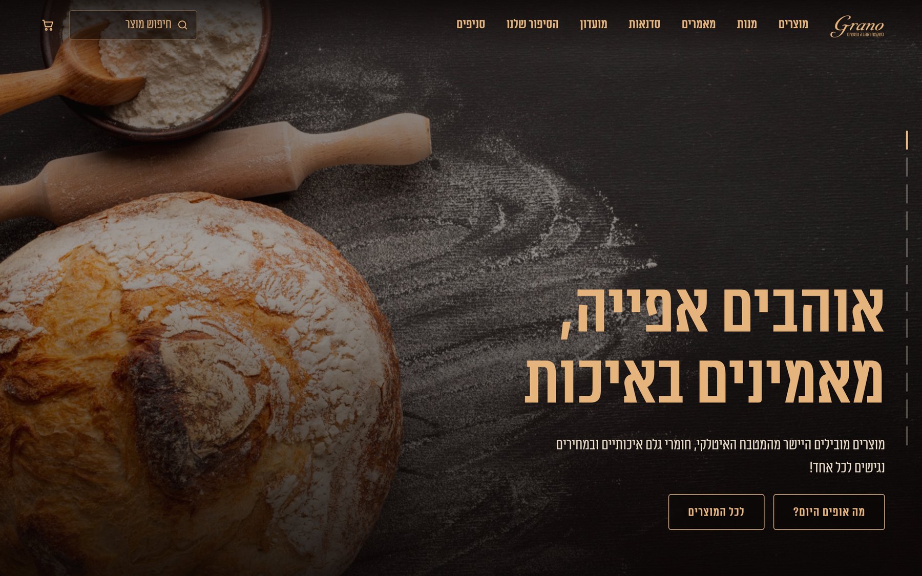
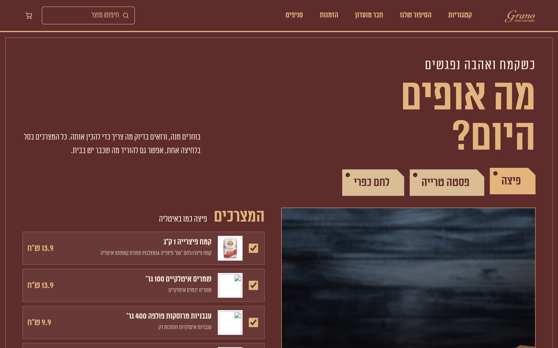
The home page of direction E, scrolling by itself. The full site, with dishes, categories, workshops and a cart, opens in its own tab.
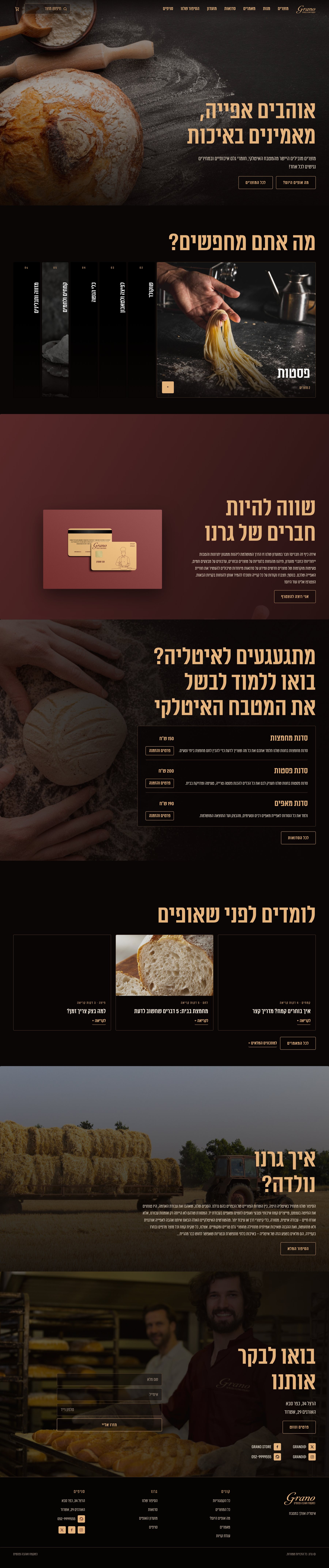
Hover to pause. In this preview the product photos that are not in the project files are left out of the strip.
Always wanted to make pizza like in Italy?
The brand talks to the visitor. So does the site: every screen opens with a question, then shows the flour to pick and everything else the dish needs.
Grano is an Italian flour, pasta and baking shop. I designed its brand book, and the first website was a student project built in Figma. This time the goal was a site that speaks the brand and works as a real store, with navigation, categories, recipes and a cart.
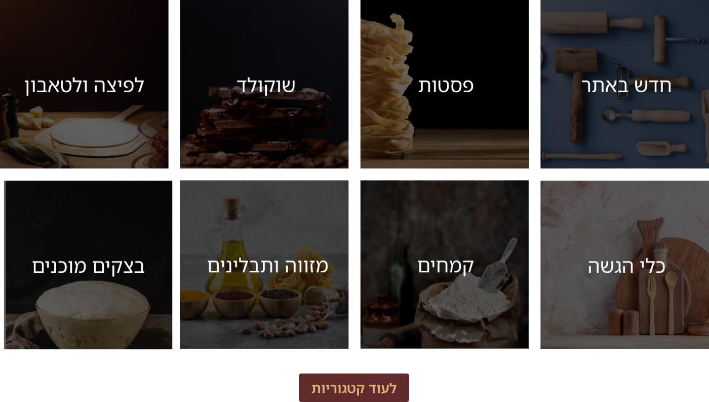
Every category looked the same, so nothing helped a visitor decide.
To make a pizza you need flour, yeast and tomatoes. The site sold them as separate things.
The brand typeface, thin frames and dark photography never reached the site.
Pulled out 6 rules the site must keep: two colours, the brand typeface, thin frames, dark photography, questions as headlines and a protected logo.
Each direction tested a different question, all within the language of the brand book.
The brand-book direction, “Stories”, fit best but was missing pages, visible navigation and categories. I added them.
Built in HTML, CSS and JavaScript and checked at desktop, tablet and phone widths after every round.
Food on black, warm light, headlines in gold.
The brand book already had a look. The old site never used it. The new one is built from it.
Not 4 websites to pick the prettiest one. Each direction tested one idea, and the final design keeps something from several of them. Hover or tap a panel.
01Dark gourmetExplored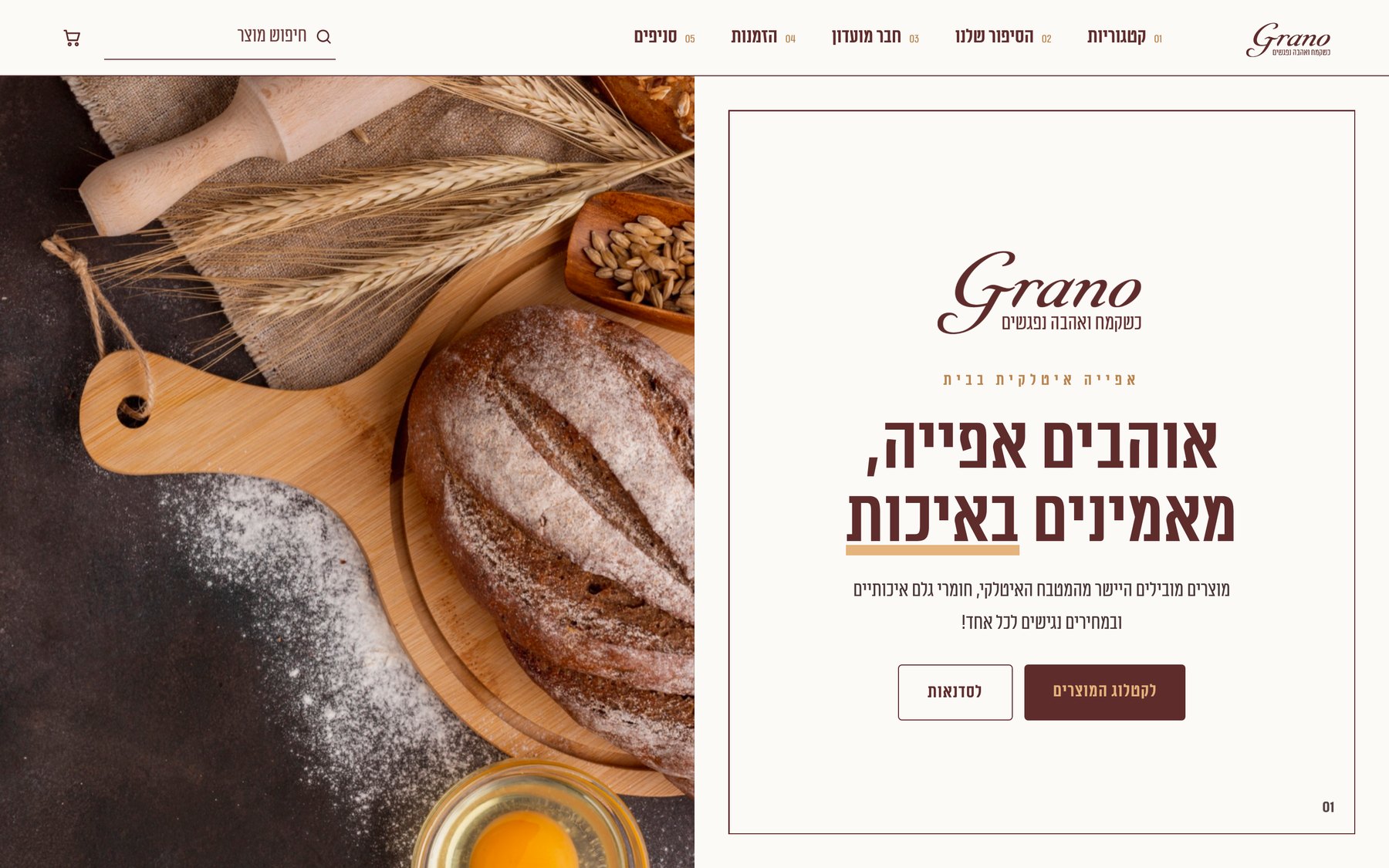 02Brand bookExplored
 03Stories (chosen)Chosen
 04Shop by recipeExplored
Burgundy #5F2C2C and gold #E5B37C, with black and white as neutrals.
Mikhmoret, the brand typeface. My first versions used a different one that the book does not list. מה אופים היום?
A thin line around pages and a short rule under titles.
Food on black, warm light, headlines in gold.
“Always wanted to make pizza like in Italy?” The copy talks to the visitor.
Protected space around it, approved colour versions, never stretched or recoloured.
The old site sold products. The new one helps someone cook.
Each screen starts with a question, then two rows: pick a flour, and see what else you need.
Eight identical tiles became six panels that open on hover and show how many products each holds.
Exact amounts, and every ingredient from the shop links to its product. Add the whole dish to the cart in one click.
Product rows scroll sideways so the title and products show together, and what sat on the left moves to the right.
Everything is square with the same radius. No circles, no pills.
A one-time reveal on scroll and feedback on hover. No looping background motion.
Balanced headings, plus a rule that keeps the last two words of every paragraph together.
Headings are always visible, and rows of products scroll sideways so the title stays on screen.
4 directions explored and 1 built as a working site: 14 page templates, 4 full recipes with exact amounts and 4 articles. The checkout and forms are a demo, and the recipes and articles are draft content to review with a baker. Concept project · HTML, CSS and JavaScript.