 Aviya Koresh
Available for workAviya Koresh
Available for work
Two sister websites for an accountant and a lawyer.
One system, two identities.
Tap to see this page wear each identity.
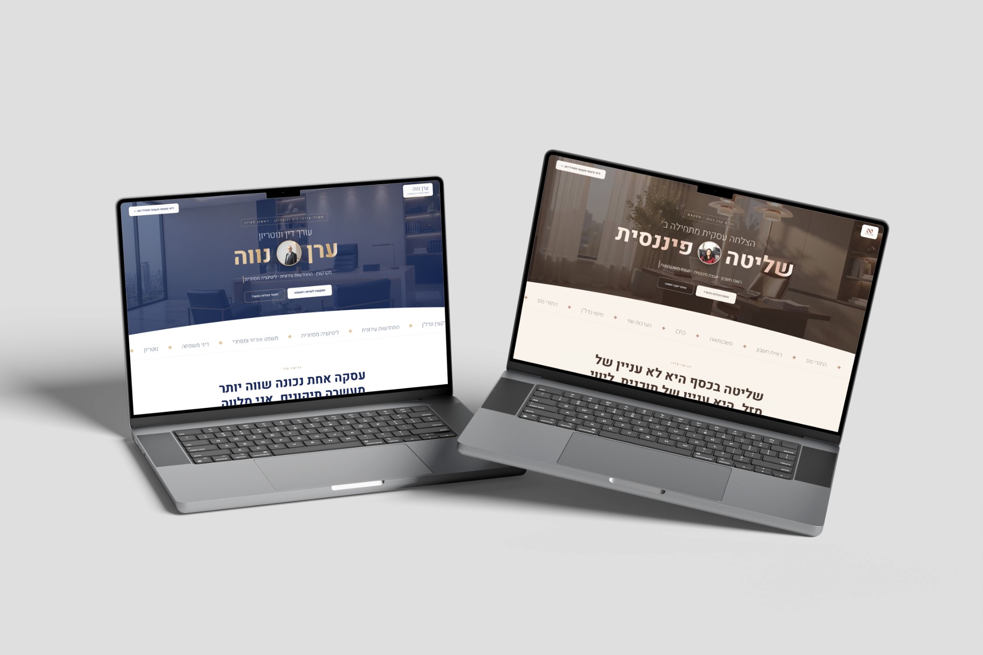
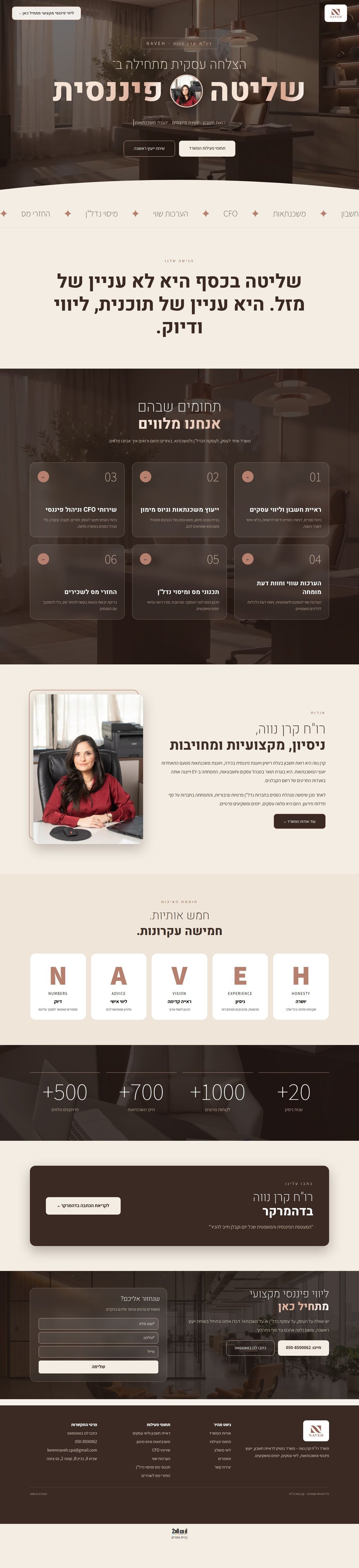
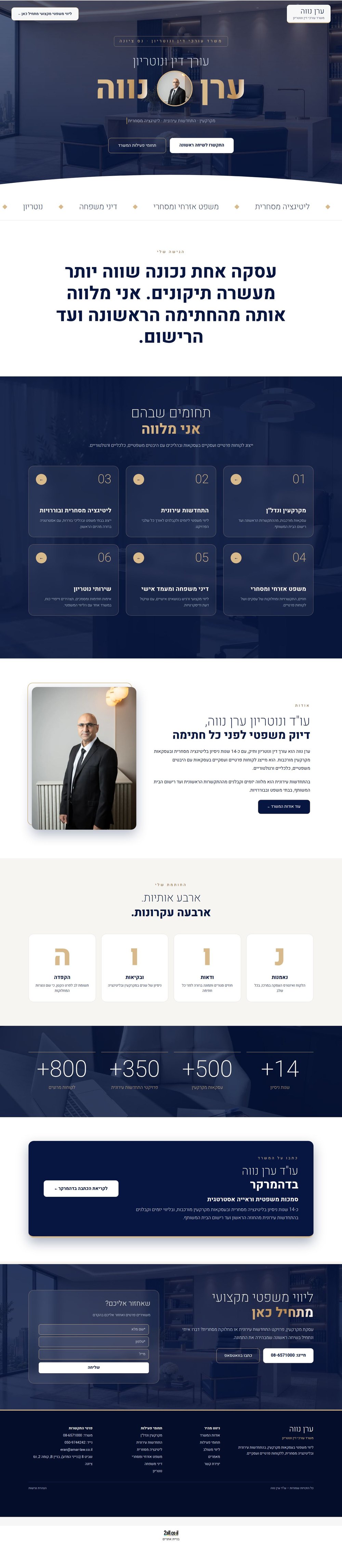
Keren is an accountant and mortgage adviser. Her husband Eran is a lawyer and notary. They needed two websites for two different firms that still feel like one office. Both are live on their own domains.
The service areas were not decided yet.
A logo, a few photos and handwritten notes from one meeting.
No written brief, so the design had to lead the conversation.
With little to work from, I researched online and scanned widely to gather material, then drafted the six service areas. The clients guided and refined the text.
Boards in a canvas, so they could react to the design before anything real was built.
A version based on their inspiration site, then a bolder one with a hero video, scroll animation, glass cards and a floating menu. The bolder one won.
A full skeleton first, then short rounds of fixes on the live site, checked on phone and desktop.
Both sites share a hero video with a portrait inside the headline, a moving service strip, a floating menu and six service cards. Color and tone make each one its own.
Warm brown, rose gold and soft beige
Navy and gold, formal and steady
Three radius sizes, chosen by the size of the component.
Emphasis stays on its own line.
No dark text on a dark background in any state.
Every fix is checked on phone and desktop, on every page.
Placeholder content was replaced step by step with the real thing: real numbers, a link to the article in TheMarker, the video and a link between the two sites. The clients were very happy.